|
|
PROBABILITY INDEX VS. PPO
The Probability Index sounds interesting. But how would the graph of the probability index be very much different/helpful than a graph of the PPO of the same two MA's , or maybe the histogram with a reasonable trigger line? Posting a graph of these to illustrate would be helpful. Thanks.
David B.
David B.

|
|
Thank you for your good question.
The Percentage price oscillator (PPO) you mention produces a plot very similar to MACD which is measuring the actual differences between two moving averages of usually 12 and 26 bars in length.
Precision Probability Index measures the precise mathematical probability of one price ( which can be a moving average or the close if length is set to 1 ) being above another price ( which is also be a slower moving average ) in a set number of bars into the future, which MACD or PPO does not do.
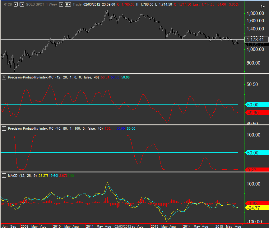
The plots appear similar at times as they are using the input same information as you can see in the screenshot, however knowing the exact percentage probability of X being greater than Y in some future moment can give the trader a useful edge.
Explanation of the diagram.
Top image Spot Gold.
Upper sub graph: PPI has 12 and 26 length and 0 exaggeration factor ( See the right scale showing exact percentage chance to rise or fall when asked to project 1 bar into the future )
Middle sub graph: PPI has exaggeration set to 100 and longer lengths which shows the versatility of this indicator. ( See the right scale showing exaggerated percentage chance to rise or fall )
Lower sub graph MACD with 12 and 26 ( right scale does not show any percentage probabilities of future movements but shows the difference between the 12 and 26 period MA's or when plotting PPO it shows the percent difference between the MA's )
Hope this helps

